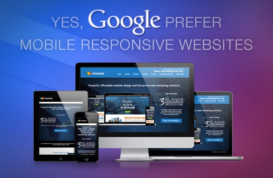
We have even made it possible for people to check how their existing website looks when viewed on different devices so that you can clearly see what your website visitors see when they look at your site – that’s how much we believe in having mobile responsive websites!!
We have all no doubt experienced this issue of mobile responsive websites. Let’s face it, no one enjoys browsing the net on their phone to find a website that isn’t mobile responsive and is clumsy to navigate around, takes too long to load and leaves you frustrated. Well, Google is attempting to combat this issue now and has introduced some alerts to let people know when they are about to go to a website that is only designed for desktop use. Obviously, people are still free to go ahead and visit the website in question but if your website isn’t mobile friendly, this Google message could deter people from coming to your website. Chances are, instead of coming to your website they will go to a competitors’ website instead.
Whilst Google recognises that some companies have a separate website that can be viewed on mobiles (mobile specific websites) the job of crawling through your website pages is made easier with a responsive design. Google is looking at various factors when it crawls your site such as how long it takes for content to load (page load times), content that can be shared and viewed easily on any device and a single url or domain name.
If you don’t already have a mobile responsive website now is the time to give it serious consideration. If you would like to talk to us about making your website mobile friendly get in touch on 1300 966 266. Getting a mobile responsive website is easier than you think.

